上周二,改一个“远古”管理后台的时候,被气笑了。
为了维护几个弹窗,居然堆了 500 多行 JavaScript :
如果你写过稍微像样一点的 Web 应用,你八成也干过这些事。 各种 modal、dropdown、tooltip……逻辑基本如出一辙。
直到那天,我刷着 MDN,突然看到一个东西—— 它让我怀疑: 我这些年,是不是都在重复造浏览器已经造好的轮子?
一个 原生 HTML 属性 ,不需要任何库、不依赖任何框架, 只加上一个单词,就能帮你搞定:
可访问性、键盘导航、焦点管理、关闭行为……
而且全部是 浏览器级别 实现。
今天就来完整拆解这个玩意: ——那个能帮你删掉几百行 JS 的属性: popover 。
那些年,我们为一个弹窗写出的屎山 传统做法,大概都长这样。
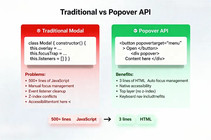
先写一个 div ,再加一坨事件监听、焦点管理、键盘处理…… 最后再祈祷: 别在某个奇怪场景下突然炸掉。
class Modal { constructor (element) { this .element = element; this .overlay = element.querySelector( '.modal-overlay' ); this .closeBtn = element.querySelector( '.modal-close' ); this .focusableElements = []; this .previousFocus = null ; this .isOpen = false ; this .bindEvents(); } open() { // 保存当前焦点 this .previousFocus = document .activeElement; // 显示弹窗 this .element.classList.add( 'is-open' ); this .isOpen = true ; // 禁止 body 滚动 document .body.style.overflow = 'hidden' ; // 设置焦点陷阱 this .trapFocus(); // 聚焦第一个可聚焦元素 this .focusFirstElement(); // 给读屏工具一个信号 this .element.setAttribute( 'aria-hidden' , 'false' ); } close() { this .element.classList.remove( 'is-open' ); this .isOpen = false ; // 恢复 body 滚动 document .body.style.overflow = '' ; // 把焦点还给触发按钮 if ( this .previousFocus) { this .previousFocus.focus(); } this .element.setAttribute( 'aria-hidden' , 'true' ); } trapFocus() { // 找出所有可聚焦元素 this .focusableElements = Array .from( this .element.querySelectorAll( 'button, [href], input, select, textarea, [tabindex]:not([tabindex="-1"])' ) ); const firstElement = this .focusableElements[ 0 ]; const lastElement = this .focusableElements[ this .focusableElements.length - 1 ]; this .element.addEventListener( 'keydown' , (e) => { if (e.key === 'Tab' ) { if (e.shiftKey) { // Shift + Tab if ( document .activeElement === firstElement) { e.preventDefault(); lastElement.focus(); } } else { // Tab if ( document .activeElement === lastElement) { e.preventDefault(); firstElement.focus(); } } } }); } focusFirstElement() { const firstFocusable = this .element.querySelector( 'button, [href], input, select, textarea, [tabindex]:not([tabindex="-1"])' ); if (firstFocusable) { firstFocusable.focus(); } } bindEvents() { // 关闭按钮 this .closeBtn.addEventListener( 'click' , () => this .close()); // 点击遮罩关闭 this .overlay.addEventListener( 'click' , (e) => { if (e.target === this .overlay) { this .close(); } }); // Esc 关闭 document .addEventListener( 'keydown' , (e) => { if (e.key === 'Escape' && this .isOpen) { this .close(); } }); } } // 初始化 const modal = new Modal( document .getElementById( 'my-modal' )); document .getElementById( 'open-modal' ).addEventListener( 'click' , () => { modal.open(); }); JS 写完,还要配一大坨 CSS:
.modal { display : none; position : fixed; top : 0 ; left : 0 ; width : 100% ; height : 100% ; z-index : 9999 ; } .modal .is-open { display : flex; align-items : center; justify-content : center; } .modal-overlay { position : absolute; top : 0 ; left : 0 ; width : 100% ; height : 100% ; background : rgba ( 0 , 0 , 0 , 0.5 ); } .modal-content { position : relative; background : white; padding : 2rem ; border-radius : 8px ; max-width : 500px ; width : 90% ; max-height : 90vh ; overflow-y : auto; z-index : 10000 ; } 每个项目都要来一遍,每个弹窗都要写个变体。 复制粘贴几十次,改来改去, 最后从“就是顶一个 div 上来嘛”, 不知不觉进化成了 300–500 行的“弹窗框架” 。
更别提这些:
那一刻我特别想问一句:
浏览器:你知道 overlay 是什么吗? 你知不知道弹窗该怎么表现?
事实证明: 它早就知道了,是我们自己硬要重写一遍。
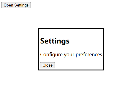
结果真相是:浏览器一个属性,就能帮你全干了 真正让我把那 500 行 JS 一键删掉的,是这么几行 HTML:
< button popovertarget = "settings-modal" > Open Settings </ button > < div id = "settings-modal" popover > < h2 > Settings </ h2 > < p > Configure your preferences </ p > < button popovertarget = "settings-modal" popovertargetaction = "hide" > Close </ button > </ div > 没看错:
你只写了三个属性:
却顺带拿到了:
✅ Esc 自动关闭 ✅ 点空白自动关闭(视模式而定) ✅ 打开时自动把焦点移进弹层 ✅ 关闭时自动把焦点还给触发按钮 ✅ 自动加上合理 ARIA 属性 ✅ 置顶渲染(不用再打 z-index 仗) ✅ body 滚动、可访问性、读屏兼容统统帮你安排好
第一次试的时候,我真的愣住了:
这些年我绞尽脑汁写的一堆 modal 管理逻辑, 浏览器原来早就准备好,只等我写对一个属性。
popover 这玩意,到底在背后做了什么?
先看最小可用例子:
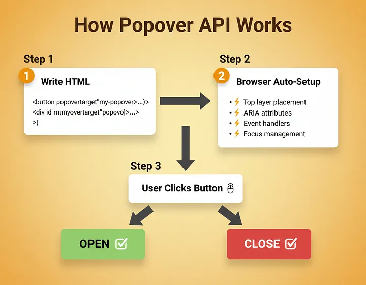
<!-- 触发按钮 --> < button popovertarget = "my-popover" > Click Me </ button > <!-- 弹出层本体 --> < div id = "my-popover" popover > < h3 > I'm a popover! </ h3 > < p > Click outside or press Escape to close me. </ p > </ div > popover 这个属性的意思大概是:
“浏览器,这个元素是一个覆盖层,你负责给它安排好该有的行为。”
加上之后,浏览器会自动做这些事:
放进一个专门的 Top Layer(最顶层渲染层) 默认隐藏(不需要你写 display: none ) popovertarget="my-popover" 则告诉按钮: “点我,就去打开那个 ID 叫 my-popover 的 popover。”
状态管理?事件?焦点? 统统由浏览器接管。
三种模式:一个属性覆盖 dropdown、modal、tooltip
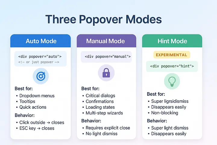
popover 不是只有开和关那么简单,它有三种模式:
<!-- 1. 默认(auto)模式:可轻松关闭 --> < div id = "menu" popover > <!-- 等同于 popover="auto" --> < a href = "/profile" > Profile </ a > < a href = "/settings" > Settings </ a > </ div > <!-- 2. manual 模式:必须显式关闭 --> < div id = "alert" popover = "manual" > < h3 > Important! </ h3 > < p > You must choose an option. </ p > < button popovertarget = "alert" popovertargetaction = "hide" > OK </ button > </ div > <!-- 3. hint 模式(实验):超容易消失的小提示 --> < div id = "tooltip" popover = "hint" > < p > This is a tooltip </ p > </ div > auto 模式(默认) : 很适合下拉菜单、导航菜单、小浮层、轻量弹出内容。
manual 模式 : 用在“用户不能随便丢失内容”的场景:
这类弹窗,只有你 明确告诉浏览器“关掉” 时才会关闭, 用户点空白、乱按键盘都不会误关。
hint 模式 (还在推进中): 适合那种“顺手看一眼的提示”,比如:
一句经验总结:
如果这个弹出内容关掉了,用户会烦, ——用 manual 。
其它都让浏览器帮你自动关, auto 即可。
popovertargetaction:精准控制打开/关闭/切换 默认情况下,带 popovertarget 的按钮,行为是“切换”(toggle)。
如果你需要更精细的控制,比如分开“打开”和“关闭”按钮,就用:
< div id = "settings" popover > <!-- 默认:toggle 行为 --> < button popovertarget = "settings" > Toggle Settings </ button > <!-- 显式:只负责打开 --> < button popovertarget = "settings" popovertargetaction = "show" > Open Settings </ button > <!-- 显式:只负责关闭 --> < button popovertarget = "settings" popovertargetaction = "hide" > Close Settings </ button > </ div > 这对 UX 很重要: 你不会希望“关闭”按钮偶尔因为状态不同而变成“打开”。
真·生产可用模式合集:可以直接 Copy 的那种 下面这些就是我在项目里真正在用的模式。 每一块你都可以直接搬进代码里开始用。
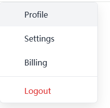
模式一:用户头像下拉菜单(Dropdown Nav) 完全可以取代你原来那一堆 dropdown 库。
< nav class = "main-nav" > < button popovertarget = "user-menu" class = "nav-trigger" > < img src = "avatar.jpg" alt = "User menu" class = "avatar" > < span > John Doe </ span > < svg class = "chevron" width = "16" height = "16" viewBox = "0 0 16 16" > < path d = "M4 6l4 4 4-4" stroke = "currentColor" stroke-width = "2" fill = "none" /> </ svg > </ button > < div id = "user-menu" popover class = "dropdown-menu" > < a href = "/profile" class = "menu-item" > < svg width = "20" height = "20" > < use href = "#icon -user" /> </ svg > Profile </ a > < a href = "/settings" class = "menu-item" > < svg width = "20" height = "20" > < use href = "#icon -settings" /> </ svg > Settings </ a > < a href = "/billing" class = "menu-item" > < svg width = "20" height = "20" > < use href = "#icon -credit-card" /> </ svg > Billing </ a > < hr class = "menu-divider" > < a href = "/logout" class = "menu-item menu-item--danger" > < svg width = "20" height = "20" > < use href = "#icon -logout" /> </ svg > Logout </ a > </ div > </ nav > /* 弹出层样式 */ .dropdown-menu { margin : 0 ; padding : 0 ; border : 1px solid #e5e7eb ; border-radius : 8px ; background : white; box-shadow : 0 10px 25px rgba ( 0 , 0 , 0 , 0.1 ); min-width : 200px ; } /* 菜单项 */ .menu-item { display : flex; align-items : center; gap : 14px ; padding : 14px 16px ; color : #1f2937 ; text-decoration : none; transition : background 0.15s ; } .menu-item :hover { background : #f3f4f6 ; } .menu-item :first-child { border-radius : 8px 8px 0 0 ; } .menu-item :last-child { border-radius : 0 0 8px 8px ; } .menu-item--danger { color : #dc2626 ; } .menu-divider { margin : 4px 0 ; border : none; border-top : 1px solid #e5e7eb ; } /* 触发按钮 */ .nav-trigger { display : flex; align-items : center; gap : 8px ; padding : 8px 14px ; background : transparent; border : 1px solid #e5e7eb ; border-radius : 6px ; cursor : pointer; transition : background 0.15s ; } .nav-trigger :hover { background : #f9fafb ; } .avatar { width : 32px ; height : 32px ; border-radius : 50% ; } .chevron { transition : transform 0.2s ; } /* 利用 :has() 让箭头旋转 */ .nav-trigger :has(+ [popover] :popover-open) .chevron { transform : rotate ( 180deg ); } 零 JS。
浏览器第一次表现得像个“成熟组件库”。
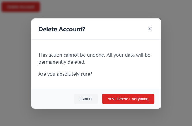
模式二:有动画、有遮罩的确认弹窗(Modal) 真正意义上的“正经弹窗”:带背景遮罩、动画、按钮区。
< button popovertarget = "confirm-delete" class = "btn btn-danger" > Delete Account </ button > < div id = "confirm-delete" popover = "manual" class = "modal" > < div class = "modal-header" > < h2 > Delete Account? </ h2 > < button popovertarget = "confirm-delete" popovertargetaction = "hide" class = "close-btn" aria-label = "Close" > < svg width = "24" height = "24" viewBox = "0 0 24 24" > < path d = "M6 6l12 12M18 6L6 18" stroke = "currentColor" stroke-width = "2" /> </ svg > </ button > </ div > < div class = "modal-body" > < p > This action cannot be undone. All your data will be permanently deleted. </ p > < p > Are you absolutely sure? </ p > </ div > < div class = "modal-footer" > < button popovertarget = "confirm-delete" popovertargetaction = "hide" class = "btn btn-secondary" > Cancel </ button > < button onclick = "deleteAccount()" class = "btn btn-danger" > Yes, Delete Everything </ button > </ div > </ div > /* 弹窗容器 */ .modal { position : fixed; top : 50% ; left : 50% ; translate : - 50% - 50% ; width : 90% ; max-width : 450px ; margin : 0 ; padding : 0 ; border : 1px solid #e5e7eb ; border-radius : 14px ; background : white; box-shadow : 0 20px 50px rgba ( 0 , 0 , 0 , 0.15 ); /* 动画初始状态 */ opacity : 0 ; transform : scale ( 0.95 ); transition : opacity 0.2s , transform 0.2s , overlay 0.2s allow-discrete, display 0.2s allow-discrete; } /* 打开状态 */ .modal :popover-open { opacity : 1 ; transform : scale ( 1 ); } /* 起始样式,配合 allow-discrete */ @starting-style { .modal :popover-open { opacity : 0 ; transform : scale ( 0.95 ); } } /* 遮罩样式 */ .modal ::backdrop { background : rgba ( 0 , 0 , 0 , 0.5 ); backdrop-filter : blur ( 4px ); opacity : 0 ; transition : opacity 0.2s , overlay 0.2s allow-discrete, display 0.2s allow-discrete; } .modal :popover-open ::backdrop { opacity : 1 ; } @starting-style { .modal :popover-open ::backdrop { opacity : 0 ; } } /* 弹窗结构 */ .modal-header { display : flex; justify-content : space-between; align-items : center; padding : 20px 24px ; border-bottom : 1px solid #e5e7eb ; } .modal-header h2 { margin : 0 ; font-size : 20px ; font-weight : 600 ; color : #1f2937 ; } .modal-body { padding : 24px ; color : #4b5563 ; line-height : 1.6 ; } .modal-footer { display : flex; justify-content : flex-end; gap : 14px ; padding : 16px 24px ; border-top : 1px solid #e5e7eb ; background : #f9fafb ; border-radius : 0 0 14px 14px ; } /* 按钮 */ .btn { padding : 10px 20px ; border : none; border-radius : 6px ; font-size : 14px ; font-weight : 500 ; cursor : pointer; transition : all 0.15s ; } .btn-secondary { background : #f3f4f6 ; color : #374151 ; } .btn-secondary :hover { background : #e5e7eb ; } .btn-danger { background : #dc2626 ; color : white; } .btn-danger :hover { background : #b91c1c ; } .close-btn { padding : 4px ; background : transparent; border : none; cursor : pointer; color : #6b7280 ; transition : color 0.15s ; } .close-btn :hover { color : #1f2937 ; } // 需要在删除后做逻辑处理时 function deleteAccount ( ) { // 删除逻辑…… console .log( 'Account deleted' ); // 手动关闭弹窗 document .getElementById( 'confirm-delete' ).hidePopover(); // 跳转或展示成功页 window .location.href = '/goodbye' ; } 这里的重点是:
popover="manual" 确保用户不会点空白就误关 焦点管理、Esc 关闭、读屏兼容——统统不用你操心
你只负责:文案 + 样式 + 业务逻辑。
模式三:轻量 Tooltip 提示 不想再为 tooltip 装一个库?可以。
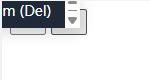
< button popovertarget = "save-tooltip" class = "icon-btn" aria-label = "Save" > < svg width = "20" height = "20" > < use href = "#icon -save" /> </ svg > </ button > < div id = "save-tooltip" popover role = "tooltip" class = "tooltip" > Save changes (Ctrl+S) </ div > < button popovertarget = "delete-tooltip" class = "icon-btn" aria-label = "Delete" > < svg width = "20" height = "20" > < use href = "#icon -trash" /> </ svg > </ button > < div id = "delete-tooltip" popover role = "tooltip" class = "tooltip" > Delete item (Del) </ div > .tooltip { margin : 0 ; padding : 8px 14px ; background : #1f2937 ; color : white; border : none; border-radius : 6px ; font-size : 14px ; white-space : nowrap; box-shadow : 0 4px 14px rgba ( 0 , 0 , 0 , 0.15 ); opacity : 0 ; transform : translateY ( 4px ); transition : opacity 0.15s , transform 0.15s , overlay 0.15s allow-discrete, display 0.15s allow-discrete; } .tooltip :popover-open { opacity : 1 ; transform : translateY ( 0 ); } @starting-style { .tooltip :popover-open { opacity : 0 ; transform : translateY ( 4px ); } } /* 使用 anchor 定位(兼容的浏览器) */ .icon-btn { anchor-name : --trigger; } .tooltip { position-anchor : --trigger; position : absolute; bottom : anchor (top); left : anchor (center); translate : - 50% - 8px ; /* 兼容不支持 anchor 的场景 */ inset : auto; } /* 小三角 */ .tooltip ::before { content : '' ; position : absolute; bottom : - 4px ; left : 50% ; translate : - 50% 0 ; width : 8px ; height : 8px ; background : #1f2937 ; transform : rotate ( 45deg ); } 如果你想要 hover 式提示,再加一点点 JS 即可:
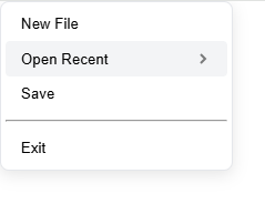
// 给所有 tooltip 触发器加 hover 行为 document .querySelectorAll( '[popovertarget]' ).forEach( trigger => { const tooltipId = trigger.getAttribute( 'popovertarget' ); const tooltip = document .getElementById(tooltipId); if (tooltip?.getAttribute( 'role' ) === 'tooltip' ) { trigger.addEventListener( 'mouseenter' , () => { tooltip.showPopover(); }); trigger.addEventListener( 'mouseleave' , () => { tooltip.hidePopover(); }); } }); 模式四:多级嵌套菜单(子菜单秒开) < button popovertarget = "file-menu" class = "menu-trigger" > File </ button > < div id = "file-menu" popover class = "menu" > < button class = "menu-item" > New File </ button > < button popovertarget = "open-submenu" class = "menu-item" > Open Recent < svg class = "chevron-right" width = "16" height = "16" > < path d = "M6 4l4 4-4 4" stroke = "currentColor" stroke-width = "2" fill = "none" /> </ svg > </ button > < button class = "menu-item" > Save </ button > < hr class = "menu-divider" > < button class = "menu-item" > Exit </ button > </ div > < div id = "open-submenu" popover class = "menu submenu" > < button class = "menu-item" > project-1.js </ button > < button class = "menu-item" > index.html </ button > < button class = "menu-item" > styles.css </ button > < button class = "menu-item" > readme.md </ button > </ div > .menu { margin : 0 ; padding : 4px ; border : 1px solid #e5e7eb ; border-radius : 8px ; background : white; box-shadow : 0 4px 14px rgba ( 0 , 0 , 0 , 0.1 ); min-width : 200px ; } .menu-item { display : flex; align-items : center; justify-content : space-between; width : 100% ; padding : 8px 14px ; background : transparent; border : none; border-radius : 4px ; text-align : left; cursor : pointer; transition : background 0.15s ; } .menu-item :hover { background : #f3f4f6 ; } .chevron-right { opacity : 0.5 ; } .submenu { /* 子菜单相对父菜单定位 */ margin-left : 4px ; } 打开“File” → 再打开 “Open Recent”。 点击空白:全部按顺序关闭。
按一次 Esc:关掉最近开的子菜单。 再按一次 Esc:关掉上层菜单。
整个层级关系和关闭顺序,全是浏览器帮你管理。
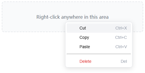
模式五:右键菜单(Context Menu) 右键菜单,其实就是一个手动定位的 popover 。
< div id = "content-area" class = "content" > Right-click anywhere in this area </ div > < div id = "context-menu" popover = "manual" class = "context-menu" > < button onclick = "handleCut()" class = "menu-item" > < svg width = "16" height = "16" > < use href = "#icon -cut" /> </ svg > Cut < span class = "shortcut" > Ctrl+X </ span > </ button > < button onclick = "handleCopy()" class = "menu-item" > < svg width = "16" height = "16" > < use href = "#icon -copy" /> </ svg > Copy < span class = "shortcut" > Ctrl+C </ span > </ button > < button onclick = "handlePaste()" class = "menu-item" > < svg width = "16" height = "16" > < use href = "#icon -paste" /> </ svg > Paste < span class = "shortcut" > Ctrl+V </ span > </ button > < hr class = "menu-divider" > < button onclick = "handleDelete()" class = "menu-item menu-item--danger" > < svg width = "16" height = "16" > < use href = "#icon -trash" /> </ svg > Delete < span class = "shortcut" > Del </ span > </ button > </ div > .context-menu { position : fixed; margin : 0 ; padding : 4px ; border : 1px solid #e5e7eb ; border-radius : 8px ; background : white; box-shadow : 0 4px 16px rgba ( 0 , 0 , 0 , 0.12 ); min-width : 220px ; } .menu-item { display : flex; align-items : center; gap : 14px ; width : 100% ; padding : 8px 14px ; background : transparent; border : none; border-radius : 4px ; text-align : left; cursor : pointer; font-size : 14px ; transition : background 0.15s ; } .menu-item :hover { background : #f3f4f6 ; } .menu-item--danger { color : #dc2626 ; } .shortcut { margin-left : auto; font-size : 14px ; color : #9ca3af ; } .content { padding : 40px ; background : #f9fafb ; border : 2px dashed #e5e7eb ; border-radius : 8px ; text-align : center; color : #6b7280 ; user-select : none; } const contentArea = document .getElementById( 'content-area' ); const contextMenu = document .getElementById( 'context-menu' ); // 右键显示菜单 contentArea.addEventListener( 'contextmenu' , (e) => { e.preventDefault(); // 位置跟随鼠标 contextMenu.style.left = e.clientX + 'px' ; contextMenu.style.top = e.clientY + 'px' ; contextMenu.showPopover(); }); // 点击其他地方关闭菜单 document .addEventListener( 'click' , (e) => { if (!contextMenu.contains(e.target) && e.target !== contentArea) { contextMenu.hidePopover(); } }); // 菜单行为 function handleCut ( ) { console .log( 'Cut' ); contextMenu.hidePopover(); } function handleCopy ( ) { console .log( 'Copy' ); contextMenu.hidePopover(); } function handlePaste ( ) { console .log( 'Paste' ); contextMenu.hidePopover(); } function handleDelete ( ) { console .log( 'Delete' ); contextMenu.hidePopover(); } 当你确实需要 JS 控制时:API 简直优雅到犯规 有些场景你确实需要 JS 控制,比如异步加载、校验、组合交互,这时候可以用原生 API:
const popover = document .getElementById( 'my-popover' ); // 打开 popover.showPopover(); // 关闭 popover.hidePopover(); // 切换 popover.togglePopover(); // 判断当前是否打开 const isOpen = popover.matches( ':popover-open' ); 就这三个方法 + 一个伪类, 替代过去需要你写半个小框架的逻辑。
还有两个事件,非常关键:
const popover = document .getElementById( 'my-popover' ); // 状态切换前触发(可取消) popover.addEventListener( 'beforetoggle' , (event) => { console .log( 'Old state:' , event.oldState); // "open" or "closed" console .log( 'New state:' , event.newState); // "open" or "closed" // 比如:不通过校验就不允许打开 if (event.newState === 'open' && !isFormValid()) { event.preventDefault(); // 阻止打开 showError( 'Please fix form errors' ); } }); // 状态切换后触发 popover.addEventListener( 'toggle' , (event) => { if (event.newState === 'open' ) { // 埋点 trackEvent( 'modal_opened' , { modalId : popover.id }); // 动态加载内容 loadModalContent(); // 把焦点送到指定元素 popover.querySelector( 'input' ).focus(); } else { // 清理现场 console .log( 'Modal closed' ); } }); beforetoggle :特别适合作权限校验、表单校验、防误操作 toggle :用来做副作用:加载数据、埋点、重置表单等等 实战例子:带校验的“错误弹窗” < button id = "submit-form" popovertarget = "validation-dialog" > Submit Form </ button > < div id = "validation-dialog" popover = "manual" class = "modal" > < h2 > Form Errors </ h2 > < ul id = "error-list" > </ ul > < button popovertarget = "validation-dialog" popovertargetaction = "hide" > Fix Errors </ button > </ div > const submitBtn = document .getElementById( 'submit-form' ); const validationDialog = document .getElementById( 'validation-dialog' ); const errorList = document .getElementById( 'error-list' ); submitBtn.addEventListener( 'click' , (e) => { const errors = validateForm(); if (errors.length > 0 ) { e.preventDefault(); // 拦截提交 // 把错误渲染进弹窗 errorList.innerHTML = errors .map( err => `<li> ${err} </li>` ) .join( '' ); validationDialog.showPopover(); } else { // 校验通过,正常提交 submitForm(); } }); function validateForm ( ) { const errors = []; const email = document .getElementById( 'email' ).value; const password = document .getElementById( 'password' ).value; if (!email.includes( '@' )) { errors.push( 'Invalid email address' ); } if (password.length < 8 ) { errors.push( 'Password must be at least 8 characters' ); } return errors; } function submitForm ( ) { console .log( 'Form submitted successfully' ); // 真正的提交逻辑…… } “保存中……” 这类加载弹窗,也可以用 popover 接管 < button onclick = "saveData()" > Save Changes </ button > < div id = "loading-spinner" popover = "manual" class = "loading-modal" > < div class = "spinner" > </ div > < p > Saving your changes... </ p > </ div > .loading-modal { padding : 32px ; border : none; border-radius : 14px ; background : white; box-shadow : 0 8px 24px rgba ( 0 , 0 , 0 , 0.12 ); text-align : center; } .spinner { width : 48px ; height : 48px ; margin : 0 auto 16px ; border : 4px solid #e5e7eb ; border-top-color : #3b82f6 ; border-radius : 50% ; animation : spin 0.8s linear infinite; } @keyframes spin { to { transform : rotate ( 360deg ); } } .loading-modal p { margin : 0 ; color : #6b7280 ; font-size : 14px ; } async function saveData ( ) { const loadingModal = document .getElementById( 'loading-spinner' ); try { // 展示加载态 loadingModal.showPopover(); // 模拟 API 调用 await fetch( '/api/save' , { method : 'POST' , body : JSON .stringify({ data : 'your data' }) }); alert( 'Saved successfully!' ); } catch (error) { alert( 'Failed to save: ' + error.message); } finally { // 无论成功失败都要关掉 loadingModal.hidePopover(); } } 一些“高级玩法”:让 popover 真正融入你的业务流 1. 动态加载内容:只打开时才拉数据 < button popovertarget = "user-profile" > View Profile </ button > < div id = "user-profile" popover class = "profile-card" > < div id = "profile-content" > < div class = "skeleton-loader" > </ div > </ div > </ div > const profilePopover = document .getElementById( 'user-profile' ); const profileContent = document .getElementById( 'profile-content' ); profilePopover.addEventListener( 'toggle' , async (event) => { if (event.newState === 'open' ) { try { const response = await fetch( '/api/user/profile' ); const userData = await response.json(); profileContent.innerHTML = ` <img src=" ${userData.avatar} " alt=" ${userData.name} "> <h3> ${userData.name} </h3> <p> ${userData.bio} </p> <a href="/profile/ ${userData.id} ">View Full Profile</a> ` ; } catch (error) { profileContent.innerHTML = ` <p class="error">Failed to load profile</p> ` ; } } }); 2. 权限控制:不让他打开,就换一个弹窗 const restrictedPopover = document .getElementById( 'premium-feature' ); restrictedPopover.addEventListener( 'beforetoggle' , (event) => { if (event.newState === 'open' ) { // 检查权限 if (!userHasPremium()) { event.preventDefault(); // 换成“升级会员”弹窗 document .getElementById( 'upgrade-prompt' ).showPopover(); } } }); function userHasPremium ( ) { return localStorage.getItem( 'premium' ) === 'true' ; } 3. 键盘快捷键 + 命令面板 // 全局快捷键 document .addEventListener( 'keydown' , (e) => { // Ctrl+K:打开命令面板 if (e.ctrlKey && e.key === 'k' ) { e.preventDefault(); document .getElementById( 'command-palette' ).showPopover(); } // Ctrl+Shift+P:打开偏好设置 if (e.ctrlKey && e.shiftKey && e.key === 'P' ) { e.preventDefault(); document .getElementById( 'preferences' ).showPopover(); } }); 4. 移动端 Bottom Sheet:原生弹层直接变底部抽屉 < button popovertarget = "mobile-menu" > Menu </ button > < div id = "mobile-menu" popover class = "bottom-sheet" > < div class = "bottom-sheet-handle" > </ div > < nav class = "bottom-sheet-content" > < a href = "/home" > Home </ a > < a href = "/explore" > Explore </ a > < a href = "/notifications" > Notifications </ a > < a href = "/profile" > Profile </ a > </ nav > </ div > @media ( max-width: 768px ) { .bottom-sheet { position : fixed; bottom : 0 ; left : 0 ; right : 0 ; margin : 0 ; padding : 0 ; border : none; border-radius : 20px 20px 0 0 ; background : white; box-shadow : 0 - 4px 24px rgba ( 0 , 0 , 0 , 0.15 ); max-height : 80vh ; transform : translateY ( 100% ); transition : transform 0.3s ease-out, overlay 0.3s allow-discrete, display 0.3s allow-discrete; } .bottom-sheet :popover-open { transform : translateY ( 0 ); } @starting-style { .bottom-sheet :popover-open { transform : translateY ( 100% ); } } .bottom-sheet-handle { width : 40px ; height : 4px ; margin : 14px auto; background : #d1d5db ; border-radius : 2px ; } .bottom-sheet-content { padding : 16px ; } .bottom-sheet-content a { display : block; padding : 16px ; color : #1f2937 ; text-decoration : none; font-size : 16px ; border-radius : 8px ; transition : background 0.15s ; } .bottom-sheet-content a :hover { background : #f3f4f6 ; } } 兼容性与渐进增强:它够“上生产”吗?
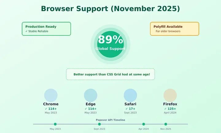
截至 2025 年底,Popover API 支持情况:
✅ Chrome 114+ ✅ Edge 114+ ✅ Safari 17+ ✅ Firefox 125+
全球覆盖率大约在 接近 9 成 。 对大多数现代 Web 应用来说,已经完全够资格上生产。
如何优雅检测支持情况? // 检测是否支持 Popover API const supportsPopover = HTMLElement.prototype.hasOwnProperty( 'popover' ); if (supportsPopover) { console .log( 'Popover API is supported' ); // 使用原生 popover } else { console .log( 'Popover API not supported' ); // 加载 polyfill 或走降级方案 } 渐进增强方案:先保证能用,再增强体验 <!-- 兜底:没有 JS 也能用的版本 --> < details class = "fallback-menu" > < summary > Menu </ summary > < div class = "menu-content" > < a href = "/profile" > Profile </ a > < a href = "/settings" > Settings </ a > </ div > </ details > <!-- 增强版:有 popover 时启用 --> < button popovertarget = "enhanced-menu" style = "display: none;" > Menu </ button > < div id = "enhanced-menu" popover class = "menu-content" > < a href = "/profile" > Profile </ a > < a href = "/settings" > Settings </ a > </ div > if (supportsPopover) { // 隐藏 fallback,展示增强版 document .querySelector( '.fallback-menu' ).style.display = 'none' ; document .querySelector( '[popovertarget]' ).style.display = 'block' ; } 给老浏览器一个“体面”的退路:polyfill < script type = "module" > if (!HTMLElement.prototype.hasOwnProperty( 'popover' )) { import ( 'https://unpkg.com/@oddbird/popover-polyfill@latest/dist/popover.min.js' ); } </ script > 这个 polyfill 只有几 KB(gzip 后), 核心行为都能模拟, 虽然 Top Layer 等高级特性可能略有差异, 但对大多数场景已经足够友好。
真正的收益:不只是“省几百行代码”那么简单 1. Bundle 体积:砍掉一整个“弹窗宇宙” 一个真实项目切换前后的对比:
切换前:
合计:39KB 只服务于弹窗。
切换到 popover 后:
直接省掉 ~33KB,节约约 85%。
对于移动端用户,这往往就是 0.5–1 秒的首屏加载差距。
2. 运行时性能:JS 再努力,也拼不过浏览器 C++ 实现 JS 弹窗:
一次打开带来的额外开销:5–10ms 起跳(低端机更夸张)。
原生 popover:
一次打开基本可以忽略不计。
当你要同时管理多个 overlay(菜单 + Tooltip + Modal)时, 差距会非常明显。
3. 内存与复杂度:你少了一个永远“半维护”的自制框架 我们过去写的 modal 管理器,会一直持有:
当你页面上有 10+ 个弹窗组件时,堆积的东西不会少。
而 popover 把这些“该浏览器管的事”都收回去了, 你只剩下业务逻辑需要维护。
常见坑:你可能会无意识做的几件“反浏览器”行为 ❌ 坑 1:自己给 [popover] 写 display: none/* 千万别这么干 */ [popover] { display : none; } [popover] :popover-open { display : block; } 后果: 你把浏览器的可见性控制彻底打断了:
✅ 正确做法: 完全不要管 display 。 只在 .popover 类上做样式(padding、阴影、圆角等)。
❌ 坑 2:继续玩 z-index 尽头对决 /* 也别这样 */ [popover] { z-index : 999999 ; } Top Layer 是一个 独立于 z-index 的维度 , 你写再大的 z-index 都不会更“靠前”。
反而可能制造一些奇怪的兼容问题。
✅ 正确做法: 不要给 popover 写 z-index。 Top Layer 天然帮你盖住页面上所有东西。
❌ 坑 3:关键弹窗却用默认 auto 模式 <!-- ❌ 点击空白就关掉:不适合危险操作 --> < div id = "confirm-delete" popover > < p > Delete everything? </ p > < button > Yes </ button > < button > No </ button > </ div > 删除账号、危险操作的确认对话框, 一不小心点外面就关了,用户会直接骂人。
✅ 正确写法:
<!-- ✅ manual:必须显式点击按钮才能关闭 --> < div id = "confirm-delete" popover = "manual" > < p > Delete everything? </ p > < button popovertarget = "confirm-delete" popovertargetaction = "hide" > Yes </ button > < button popovertarget = "confirm-delete" popovertargetaction = "hide" > No </ button > </ div > ❌ 坑 4:坚持自己再维护一套“弹窗状态机” // ❌ 不要再写这种管理栈了 let modalStack = []; let isModalOpen = false ; function openModal ( id ) { isModalOpen = true ; modalStack.push(id); // ……更多复杂逻辑 } 浏览器已经替你维护好了:谁打开、谁关闭、谁在顶层。 你再搭一个平行世界,只会导致两边状态不同步。
✅ 正确做法:
需要知道状态时,用 :popover-open 检查 需要做副作用,用 beforetoggle 和 toggle ❌ 坑 5:用 JS 手搓一堆奇怪的动画 // ❌ 无需再用 setInterval 做透明度动画 function openModalWithAnimation ( modal ) { modal.style.opacity = '0' ; modal.showPopover(); let opacity = 0 ; const interval = setInterval( () => { opacity += 0.1 ; modal.style.opacity = opacity; if (opacity >= 1 ) clearInterval(interval); }, 16 ); } 动画交给 CSS,JS 做业务。 世界会变得非常清爽。
✅ 正确写法:
[popover] { opacity : 0 ; transition : opacity 0.2s ; } [popover] :popover-open { opacity : 1 ; } 想迁移到 popover?给你一份拆弹清单 阶段一:盘点现状 [ ] 列出项目里所有:modal / dropdown / tooltip / context menu [ ] 看看哪些是纯展示、哪些有复杂业务逻辑 [ ] 标记出适合先迁移的简单场景(比如用户菜单、简单弹窗) [ ] 评估你的用户浏览器版本(看兼容性是否 OK)
阶段二:动手改造 [ ] 选 1–2 个组件,用 popover 重写 [ ] 用键盘 Tab / Shift+Tab / Esc 全面跑一遍 [ ] 用读屏工具(NVDA / VoiceOver 等)听一遍体验 [ ] 检查嵌套弹窗、多个 popover 同时存在时的行为 [ ] 确认 manual / auto 模式是否选对场合
阶段三:测试 & 上线 [ ] 在 Chrome / Firefox / Safari / Edge 全部跑一遍 [ ] 做一次简单的无障碍扫描(axe 等工具) [ ] 对比迁移前后的 bundle 体积与首屏时间 [ ] 用小规模灰度或 feature flag 挂上线 [ ] 逐步删掉旧的 modal 管理代码
真正的底层趋势:Web 平台终于在“长大”,我们也该收手了 Popover API 只是这波“原生 UI 能力升级”的一小块。
你会发现最近几年,浏览器在持续给我们补这些“久违的常识”:
CSS anchor 定位 tooltip / 弹出层 即将到来的原生自定义选择框、原生 tooltip 元素…… 以前,我们是被迫在框架里重建一整套浏览器已经部分支持的东西:
“我想要一个弹窗”
→ 安装库 → 写样式 → 管状态 → 处理焦点 → 打补丁 → 被无障碍专家怼
现在,Web 平台终于开始承担它应该承担的那部分责任:
“这些通用交互,我来帮你搞定,你只负责业务和体验即可。”
框架不会因此“失业”, 它们会变得更轻、更专注:
React/Vue/Svelte 管控你的状态和业务逻辑 最后一句:下次想写一个弹窗,先问问自己——真的需要 JS 吗? 我删掉 500 行 modal 管理代码,用几个属性替代, 得到的不是“勉强凑合”的实现, 而是:
真正高级的前端不是“什么都自己写一遍”, 而是知道: 什么该交给平台,什么才值得自己造轮子。
你可以从特别小的一步开始:
等哪天,你再也不用在半夜两点调焦点陷阱、 也不用为一个 z-index 失眠, 你会非常感谢,现在这个愿意尝试原生方案的自己。
阅读原文:原文链接


 400 186 1886


